
dpk431 #000: Page One
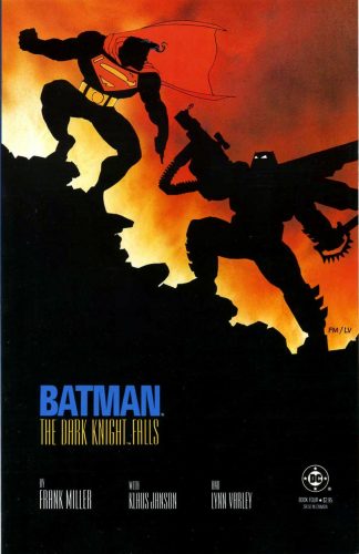
The silhouette of the “RIDICULOUSLY HULKING COSTUMED FIGURE” is a tip of the hat to the noirish comic book poses of the ’80s.
The best examples? Frank Miller’s The Dark Knight Returns covers, especially #1 and #4 (left, and lovingly appropriated from IGN’s “Top 30 Frank Miller Comic Book Covers”).
Page One Notes:
- Sorry, Garamond. Our time together was wonderful, but it’s time I moved on. And, yes, there is another font. One who better understands the feel of my scripts. Who is it, you ask? Courier. But don’t feel bad. We’ll always have the Author’s Note.
- Apologies in advance for the “series of single panel, full-sized 16:9 pages.” Your patience will be rewarded. At least I hope so!
- The black frame around the script is, in fact, a 16:9 aspect ratio. And whilst I don’t have the patience or talent to draw, I do have the patience and talent to create page panels in Photoshop. In this case, a 978×550 page with a 964×536 frame therein.
- Early Punisher appearances were frequently punctuated with honest-to-god War Journal Entries. Gotta love the ’70s, right?
- Quite some time after writing this script, I was working for AMC on a Breaking Bad project near New York’s Chinatown. I looked out the window and came face-to-face with the exact roof layout I described in this issue. Cue apropos music.